
Technology
Cyanová: The Complete Guide to Its Meaning, Color Science, and Creative Uses

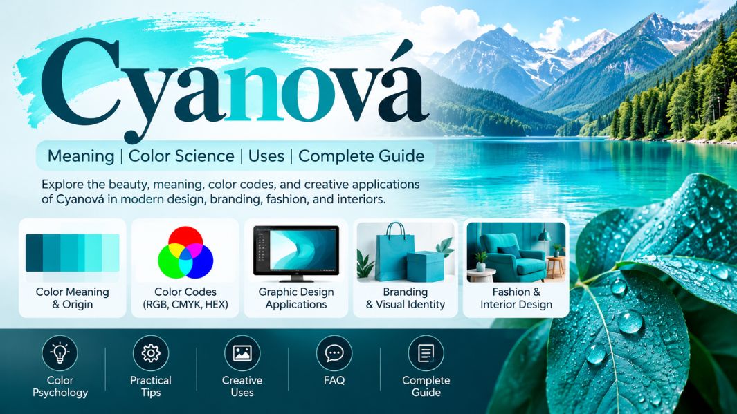
Colors shape how we experience the world, from natural landscapes to modern businesses’ visual identities. Among the many shades associated with freshness, clarity, and creativity, Cyanová stands out as an interesting term connected to the familiar blue-green color cyan. Although the word may seem unfamiliar to English speakers, its meaning becomes clearer when we explore its linguistic background and its relationship to color theory. Cyan is widely used in digital displays, commercial printing, graphic design, and photography. Its vibrant appearance makes it useful for creating noticeable visual elements without relying entirely on traditional blue or green. Understanding Cyanová involves more than recognizing a particular shade. It also requires an appreciation of how different languages and creative industries name, represent, and interpret colors.
This article explores the meaning and origins of Cyanová, its connection with Cyan, important color codes, practical design applications, and ways to use blue-green shades effectively in everyday creative projects.
What Is Cyanová?
Cyanová is a color-related expression associated with Cyan, the bright blue-green color positioned between blue and green in common color descriptions. The term is linguistically connected to Czech and Slovak, where adjectives change their endings according to grammatical gender. In this context, the ending -ová can identify a feminine adjective describing something cyan-colored. For example, the Slovak expression cyanová farba refers to a cyan color.
The word itself does not establish an entirely new scientific color category. Instead, it describes an established color through a particular linguistic form. This distinction matters because some English-language discussions use Cyanová as a broader, creative label for blue-green aesthetics. Such interpretations may suit artistic projects, but they should not be confused with an internationally standardized color specification. When discussing a precise digital color, the established English name cyan remains the more technically recognizable expression.
The Linguistic Origins and History of Cyanová
The term’s history begins with the word Cyan, traceable to the ancient Greek kyanos, associated with dark blue coloring, enamel, and blue minerals. Over time, related terminology entered European languages and became connected with increasingly specific applications in art, science, and printing. Modern English describes a brighter blue-green color rather than the deep blue suggested by its ancient linguistic origins.
Cyanová’s distinctive appearance comes from combining an established color root with a Slavic grammatical ending. Czech and Slovak use grammatical agreement between adjectives and nouns, unlike English, where most color adjectives remain unchanged. Consequently, the word shows how an internationally recognized visual concept can take different forms depending on the language. Its accented final letter also gives the term a recognizable written identity, although that spelling alone does not indicate a special pigment, invention, or independently defined shade.
Understanding the Color Science Behind Cyanová
To understand Cyanová’s visual foundation, it helps to examine how Cyan is produced. In the RGB color model used by digital screens, cyan results from combining green and blue light while setting the red component to zero. Pure digital Cyan is consequently bright and highly saturated. However, a cyan-colored object can look different depending on lighting, surrounding colors, materials, and the technology used to reproduce it.
Color perception also depends on context. A blue-green shade positioned beside a dark navy background may appear especially luminous, while the same shade on a white surface can seem softer and less prominent. Changing saturation and brightness creates further variations, from pale aqua to deeper blue-green tones. This flexibility explains why cyan-inspired palettes are useful across many visual applications. Nevertheless, when precision matters, identify lighter and darker alternatives by their own color values.
Cyanová Color Codes and Digital Representation
Color codes allow designers to reproduce a specific appearance consistently across websites, applications, and digital graphics. The standard CSS color cyan has the hexadecimal value #00FFFF, equivalent to RGB (0, 255, 255). In the HSL system, that same color is represented by 180 degrees of hue, 100% saturation, and 50% lightness. The CSS name aqua also represents the same digital color value.
These figures describe standard web cyan rather than establishing a separately defined technical color named Cyanová. A designer using the term creatively might select a darker, softer, or greener alternative. That is why recording exact values is more dependable than relying on a descriptive name alone.
Some useful related color references include:
- Cyan: #00FFFF
- Dark Cyan: #008B8B
- Turquoise: #40E0D0
- Teal: #008080
- Aquamarine: #7FFFD4
Each option offers a different balance of brightness, depth, and saturation, letting designers choose the right shade for the job.
How Cyanová Relates to RGB and CMYK Printing
One of Cyan’s most important technical roles is in CMYK printing, where it functions alongside magenta, yellow, and black. Unlike RGB displays, which create color with light, printed materials rely on inks that absorb and reflect different parts of incoming light. Cyan ink primarily absorbs red light while reflecting blue and green components, making it essential for reproducing a broad range of printed colors.
This difference matters when a design moves from a digital screen to paper or packaging. A brilliant cyan on a monitor may not look equally vivid in print because inks and materials reproduce color differently. Paper texture, ink characteristics, and printing conditions can influence the final result. Designers preparing professional materials should therefore use appropriate color profiles and check proofs rather than assuming that a screen’s RGB value will automatically translate into an identical printed appearance.
Cyanová Compared With Cyan, Turquoise, and Teal
Blue-green colors often resemble one another, yet they can create noticeably different visual impressions. Cyan is generally bright and highly saturated in its pure digital form. Turquoise is commonly associated with a slightly greener appearance, although its precise tone varies. Teal is usually darker and more subdued, while aquamarine often appears lighter and gentler.
Cyanová shouldn’t automatically be treated as a separate technical shade between these colors. Its original meaning relates to Cyan itself. Nevertheless, someone developing a creative palette under that name might incorporate neighboring blue-green tones to create greater variety. For example, a website could feature vivid cyan accents, teal navigation elements, and pale aquamarine backgrounds. The resulting composition would maintain a coherent visual identity while avoiding the overwhelming effect of using one saturated color across every surface.
The Role of Cyanová in Graphic Design
Graphic designers often use blue-green palettes because they offer clear visual contrast and flexible combinations. A bright cyan accent can make selected illustrations, icons, headings, or decorative elements more noticeable, especially against darker neutral backgrounds. Softer variations can support broader areas of a layout without dominating the overall composition.
Successful application requires balance. A page filled with highly saturated Cyan can feel visually intense, especially when it competes with photographs, buttons, and typography. Visual hierarchy helps determine where stronger color should appear and where quieter tones work better. Designers must also consider accessibility. Bright Cyan on white provides insufficient contrast for small, everyday text, while dark text on a cyan background may be easier to read. Good design depends on tested contrast ratios, not simply on whether a combination appears attractive.
Cyanová in Branding and Visual Identity
A distinctive blue-green palette can help businesses create a recognizable visual identity. Cyan-inspired accents may convey modernity, clarity, or energy, depending on typography, imagery, and the surrounding design. Technology businesses, educational platforms, creative studios, and consumer brands can all experiment with these shades, although no particular emotional response is guaranteed.
Effective branding depends on consistency, not color selection alone. A company should define its primary shade, supporting colors, background tones, and typography standards before applying them across websites, packaging, presentations, and advertisements. When Cyanová is used as an internal palette name, specifying the corresponding HEX or print values prevents confusion between designers and suppliers. This approach turns a broad aesthetic idea into a practical visual system that stays recognizable across formats.
Creative Applications in Interior Design and Fashion
The wider cyan color family can also influence interior decoration and clothing choices. In residential spaces, pale blue-green surfaces can create a cooler look, while deeper shades can add stronger accents through furniture, textiles, or decorative accessories. Neutral materials such as white ceramics, light wood, and warm beige fabrics can help moderate the brightness of a vivid cyan feature.
In fashion, pair blue-green clothing and accessories with navy, charcoal, cream, or select warm colors to create contrasting outfits. The overall effect depends on fabric texture, lighting, and the proportion of each shade. Rather than treating Cyanová as a single compulsory color, a more useful approach is to explore the cyan family and select tones that suit the material and setting. This flexibility makes blue-green palettes adaptable to both restrained and expressive styling.
Color Psychology and the Perception of Cyanová
Colors can influence impressions, but their psychological effects are more complex than simple universal rules. In design discussions, blue is often associated with calmness or stability, while green is often linked to nature and freshness. Cyan combines visual characteristics of both color families, which may encourage similar interpretations in particular settings.
However, personal experience, culture, context, and surrounding design elements shape color psychology. It’s inaccurate to claim that Cyanová automatically reduces stress, improves concentration, or builds trust with every viewer. Designers should instead evaluate how a particular audience responds to a complete composition. A calm-looking blue-green background may support a relaxing presentation, but the outcome will also depend on lighting, readability, imagery, and individual preferences.
Practical Tips for Using Cyanová Effectively
Start by deciding whether a project needs standard Cyan or a broader blue-green aesthetic. For technical design work, choose an exact HEX, RGB, or CMYK specification and record it in the project’s style guide. For creative work, begin with a primary color and develop lighter and darker variations to establish visual depth.
Contrast deserves special attention. Check text against its background, assess designs on different screen sizes, and avoid relying on color alone to communicate essential information. When preparing printed materials, review proofs under appropriate lighting. Consistency matters most when the same visual identity appears on digital displays, fabrics, and packaging. These practical steps make cyan-based designs more usable and professional.
Frequently Asked Questions About Cyanová
What does Cyanová mean?
Cyanová is a Czech- and Slovak-related color expression describing something cyan-colored. It relates to the established blue-green color cyan.
Is Cyanová a separate official color?
No separate, internationally standardized color called Cyanová has been established in the major digital color definitions discussed here. Standard Cyan is represented by #00FFFF in CSS.
What is the difference between Cyanová and turquoise?
Cyanová generally refers to cyan coloring, while turquoise usually describes a related blue-green shade with somewhat different visual characteristics.
Can Cyanová be used in website design?
Yes. You can use Cyan and related blue-green shades for accents, backgrounds, icons, and branding, as long as you carefully consider readability and accessibility.
Why is cyan important in printing?
Cyan is one of the four process inks used in CMYK printing. Together with magenta, yellow, and black, it helps reproduce a wide variety of colors.
Conclusion
Cyanová offers an interesting connection between language, color science, and modern creative expression. Although the word has a recognizable Czech and Slovak linguistic background, its visual foundation is the established blue-green color cyan rather than a newly discovered shade. Understanding that distinction makes it easier to interpret the term accurately and apply cyan-inspired colors meaningfully.
From digital graphics and commercial printing to branding, interiors, and fashion, the cyan family provides considerable creative flexibility. The best results come from selecting precise colors, balancing visual intensity, and considering the intended audience. Ultimately, Cyanová is a familiar color concept expressed through a distinctive linguistic form, with practical applications across many areas of visual design.

Julie Hallam: The Untold Story of Jeremy Irons’ First Wife and Her Acting Career

Alizeh Keshvar Davis Jarrahy: The Remarkable Story of Geena Davis’s Daughter Who Inspired Change in Hollywood

Michael Ciminella: The Remarkable Life of Ashley Judd’s Father and Naomi Judd’s First Husband

Methatreams Explained: The Surprising Truth About Free Sports Streaming, Safety, and Legal Alternatives

Debra Bollman: The Remarkable True Story Behind Her Viral Nigel Hayes Moment

sosoactive: The Surprising Evolution of a Digital Media Platform and Its Online Influence

Atlanta Hawks vs Celtics Match Player Stats: Stunning 112–102 Victory and Complete Game Analysis

Milwaukee Bucks vs Lakers Match Player Stats: Thrilling 105–101 Result, Top Performers and Full Analysis

Atlanta Falcons vs 49ers Match Player Stats: Stunning McCaffrey Performance and Complete Game Breakdown

Tamil Students Association: The Powerful Role of Culture, Community, and Student Success

Everest Base Camp Trek vs Manaslu Circuit Trek: Routes, Difficulty, Costs, Altitude and Mountain Experience

Classroom 15x: The Ultimate Guide to Free Online Games, Features, Benefits, and Safe Gaming

Crackstube Explained: A Complete Guide to Its Features, Content, Safety, and Digital Publishing Platform

Provascin: A Complete Guide to Its Ingredients, Potential Benefits, Uses, and Safety

ABS Testauslösung: Bedeutung, Funktion, häufige Fehler und wichtige Sicherheitstipps

HMJones.net Explained: A Complete Guide to Business Loans, Funding Options, and Smarter Financial Decisions

Startup Booted Fundraising Strategy: A Powerful Guide to Smart Funding and Sustainable Business Growth

Pedal And Post Collapse: The Shocking Closure of Oxford’s Pioneering Green Delivery Company

Glorvix Com About Us: The Essential Guide to Its Services, Mission, and Company Background

Sajar Plastics Inc: The Remarkable Story Behind Its Advanced Plastic Manufacturing Technology
Julie Hallam: The Untold Story of Jeremy Irons’ First Wife and Her Acting Career
Alizeh Keshvar Davis Jarrahy: The Remarkable Story of Geena Davis’s Daughter Who Inspired Change in Hollywood
Michael Ciminella: The Remarkable Life of Ashley Judd’s Father and Naomi Judd’s First Husband
Methatreams Explained: The Surprising Truth About Free Sports Streaming, Safety, and Legal Alternatives
Debra Bollman: The Remarkable True Story Behind Her Viral Nigel Hayes Moment
sosoactive: The Surprising Evolution of a Digital Media Platform and Its Online Influence
Atlanta Hawks vs Celtics Match Player Stats: Stunning 112–102 Victory and Complete Game Analysis
Milwaukee Bucks vs Lakers Match Player Stats: Thrilling 105–101 Result, Top Performers and Full Analysis
Atlanta Falcons vs 49ers Match Player Stats: Stunning McCaffrey Performance and Complete Game Breakdown
Tamil Students Association: The Powerful Role of Culture, Community, and Student Success
-
 Blog3 months ago
Beyond the Cages: How an Artificial Zoo Could Redefine Wildlife Travel
-
 Destination Guides3 months ago
Beyond the Map: Discovering Haslhof in Italy and Bavaria
-
Adventure Travel3 weeks ago
Everest Base Camp Trek vs Manaslu Circuit Trek: Routes, Difficulty, Costs, Altitude and Mountain Experience
-
 Entertainment2 weeks ago
Classroom 15x: The Ultimate Guide to Free Online Games, Features, Benefits, and Safe Gaming