
Technology
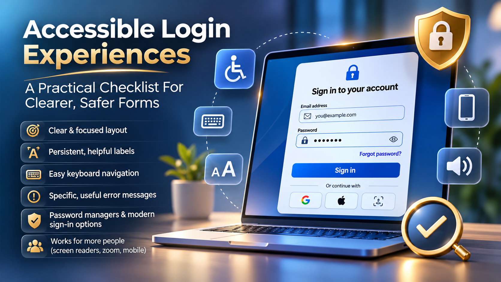
Accessible Login Experiences: A Practical Checklist For Clearer, Safer Forms

Post Preview
Key Takeaways
- Keep the sign-in task visually focused and easy to understand at a glance.
- Use persistent labels, clear focus indicators, and specific error messages.
- Support password managers, paste actions, and appropriate modern sign-in options.
- Test the complete experience with keyboards, screen readers, zoom, and mobile devices.
- Offer recovery and verification choices without turning security into a barrier.
A login page is often the first step a person needs to take to complete an important task in a product. Effective login page design makes that task feel direct, understandable, and dependable, whether someone is signing in on a phone, using a password manager, or navigating with a keyboard.
Accessibility and security should support each other. A secure form that legitimate users cannot understand or operate creates unnecessary lockouts, while an easy form that exposes account details can create risk. The goal is a calm, clear path that helps users verify their identity and recover when something goes wrong.
Why Login Pages Deserve More Design Attention
Login forms may be short, but they involve several high-stakes decisions. Users must recognize the service, identify the correct credential fields, enter information accurately, respond to security prompts, and seek help if they encounter issues. A missing label, weak focus state, or hidden recovery option can stop progress even when a person knows their password.
For example, a user may enter the correct email address but need to reset a password. If the recovery link is buried below unrelated promotional content, the next step is unclear. Good design anticipates this common situation and makes help visible before frustration builds.
Start With A Clear And Focused Layout
Place the form in a distinct visual area and begin with a concise heading such as “Sign in to your account.” Supporting text should answer immediate questions, not compete for attention. Keep account creation available nearby, but visually separate it from sign-in so users do not accidentally start the wrong process.
- Put the primary task, fields, and sign-in button in a predictable order.
- Use one clear primary action, such as “Sign in,” rather than a vague “Submit.”
- Remove decorative elements that crowd the form or push recovery help out of view.
- Keep messages about privacy, device trust, or verification brief and relevant to the current step.
Use Labels That Stay Helpful
Every input needs a visible label that remains available after typing begins. Placeholder text can provide an example, but it should not be the only way to identify a field. Plain labels such as “Email address” and “Password” are easier to understand than internal or overly technical wording.
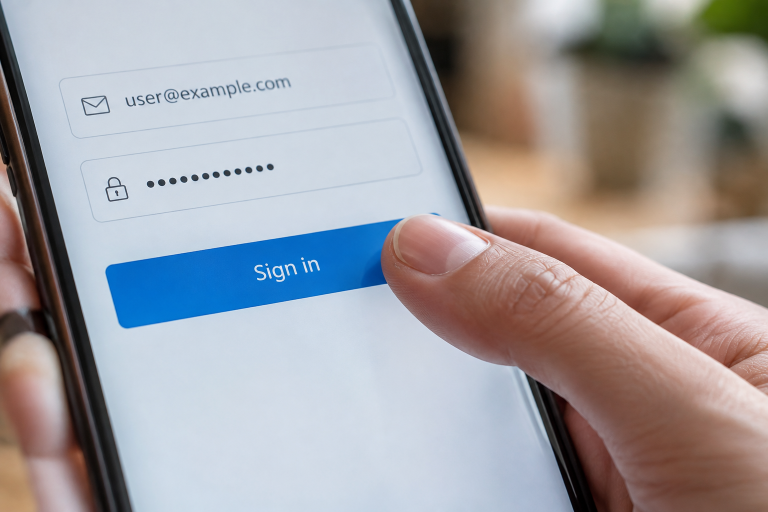
Labels also need to be associated with their inputs in code so assistive technology can communicate the field’s purpose. Guidance on accessible login experiences emphasizes visible, programmatically connected labels, autocomplete support, text-based errors, and alternatives to memory-heavy authentication steps.
Make The Form Easy To Use With A Keyboard
A user should be able to complete the entire login flow without a mouse. Pressing Tab should move through controls in a sensible sequence, and every control should show a highly visible focus indicator. This includes password visibility buttons, “Forgot password?” links, verification choices, and modal controls.
- Do not remove focus outlines unless an equally visible replacement is provided.
- Ensure pop-ups move focus to their content and allow users to close them predictably.
- Make sure focus does not become trapped where the user cannot continue or return.
- Confirm that the Enter key can submit the form when the expected fields are complete.
Write Better Error Messages
Error messages should tell users what needs attention and what they can do next. “Enter your password” is more useful than “Invalid input.” When credentials do not work, the message should avoid confirming whether a particular account exists. A neutral message such as “The email address or password is incorrect” can guide the user without disclosing sensitive account information.
Place field-specific errors close to the affected field, preserve information already entered where it is safe to do so, and do not rely on a red outline alone. Important status changes should be announced to assistive technology. A web accessibility evaluation illustrates practical issues that can interrupt sign-in, including unclear names, unannounced login errors, missing input labels, low-contrast focus states, and keyboard barriers.
Support Password Managers And Modern Sign-In Options
Password fields should allow paste actions and work with browser autofill and password managers. Appropriate autocomplete values help browsers and assistive tools identify username and current-password fields. A visible show-and-hide password control can also help users catch typing mistakes, especially on small screens or when entering long credentials.
Where appropriate, offer alternatives such as passkeys, one-time codes, trusted-device confirmation, or federated sign-in. No single method works best for every person or situation, so meaningful choice is valuable. Each alternative still needs its own accessible instructions, error handling, and recovery path.
Reduce Friction Without Removing Protection
Ask only for information required at the current stage. If extra verification is needed, explain why it is happening and provide help when a code is delayed, expires, or cannot be received. Behind-the-scenes protections, such as rate limiting and risk-based checks, can often reduce abuse without forcing every legitimate user through disruptive challenges.
Use CAPTCHA and cognitive tests carefully. They can create barriers for people who have visual, motor, language, or cognitive disabilities. Before adding one, consider whether less disruptive safeguards can address the same security concern.
Make Login Pages Work For More People
- Check that text, controls, and focus states remain distinguishable from their backgrounds.
- Test browser zoom to confirm fields, buttons, and recovery options remain usable.
- Use touch targets that are practical to activate on smaller screens.
- Give every icon-only control an understandable accessible name.
- Ensure confirmations, errors, and verification updates are available to screen readers.
A Practical Testing Process For 2026
Test Success, Failure, And Recovery
- Review the visible structure, labels, instructions, and button wording.
- Complete sign-in using only a keyboard.
- Test with a screen reader and confirm that labels, errors, and status updates are announced.
- Check the page at increased zoom and on phone, tablet, and desktop layouts.
- Try empty fields, an incorrect password, an expired code, and a delayed verification message.
- Test password manager filling, paste behavior, password visibility, and account recovery.
- Observe representative users completing the full journey and retest after meaningful changes.
Conclusion
A strong login experience does not need extra decoration or unnecessary hurdles. It needs clear language, stable structure, accessible controls, useful feedback, and security measures that respect the user’s time. Teams that test the full sign-in and recovery journey can reduce avoidable confusion while helping more people access their accounts safely.

Accessible Login Experiences: A Practical Checklist For Clearer, Safer Forms

How To Design Useful Conversational AI Avatars For Learning And Customer Support

Tobiko: The Colorful Japanese Delicacy That Makes Sushi More Delicious and Exciting

Reviews of Competitors: A Powerful Guide to Understanding Customer Feedback and Winning Business Strategies

InstaPV: The Ultimate Guide to Anonymous Instagram Viewing, Features, Privacy, and Safety in 2026

Puffco: The Complete Guide to Its History, Innovative Technology, Products, and Brand Evolution

Katie Drysen: The Remarkable Life, Career, and Love Story of Jason Earles’ Wife

Noah Earles: Fascinating Facts About Jason Earles’ Daughter, Family, and Private Life

Barbara Krajkowski: Inspiring Life, Theater Career, Family, and Lasting Legacy

Sebastian Sartor: The Remarkable Life, Music Career, Family, and Success of Connie Nielsen’s Son

Everest Base Camp Trek vs Manaslu Circuit Trek: Routes, Difficulty, Costs, Altitude and Mountain Experience

Classroom 15x: The Ultimate Guide to Free Online Games, Features, Benefits, and Safe Gaming

How Dental Implant Quotes Are Built: A Practical Cost Guide for Maple Grove, Minnesota

Crackstube Explained: A Complete Guide to Its Features, Content, Safety, and Digital Publishing Platform

Jeremy Yaffe: The Remarkable Untold Story of Alan Arkin’s First Wife and Her Life Beyond Hollywood

Startup Booted Fundraising Strategy: A Powerful Guide to Smart Funding and Sustainable Business Growth

ABS Testauslösung: Bedeutung, Funktion, häufige Fehler und wichtige Sicherheitstipps

Provascin: A Complete Guide to Its Ingredients, Potential Benefits, Uses, and Safety

Nippybox Explained: What Happened to the Popular File-Sharing Platform in 2026?

HMJones.net Explained: A Complete Guide to Business Loans, Funding Options, and Smarter Financial Decisions
Accessible Login Experiences: A Practical Checklist For Clearer, Safer Forms
How To Design Useful Conversational AI Avatars For Learning And Customer Support
Tobiko: The Colorful Japanese Delicacy That Makes Sushi More Delicious and Exciting
Reviews of Competitors: A Powerful Guide to Understanding Customer Feedback and Winning Business Strategies
InstaPV: The Ultimate Guide to Anonymous Instagram Viewing, Features, Privacy, and Safety in 2026
Puffco: The Complete Guide to Its History, Innovative Technology, Products, and Brand Evolution
Katie Drysen: The Remarkable Life, Career, and Love Story of Jason Earles’ Wife
Noah Earles: Fascinating Facts About Jason Earles’ Daughter, Family, and Private Life
Barbara Krajkowski: Inspiring Life, Theater Career, Family, and Lasting Legacy
Sebastian Sartor: The Remarkable Life, Music Career, Family, and Success of Connie Nielsen’s Son
-
 Destination Guides3 months ago
Beyond the Map: Discovering Haslhof in Italy and Bavaria
-
 Blog3 months ago
Beyond the Cages: How an Artificial Zoo Could Redefine Wildlife Travel
-
Adventure Travel4 weeks ago
Everest Base Camp Trek vs Manaslu Circuit Trek: Routes, Difficulty, Costs, Altitude and Mountain Experience
-
 Entertainment3 weeks ago
Classroom 15x: The Ultimate Guide to Free Online Games, Features, Benefits, and Safe Gaming